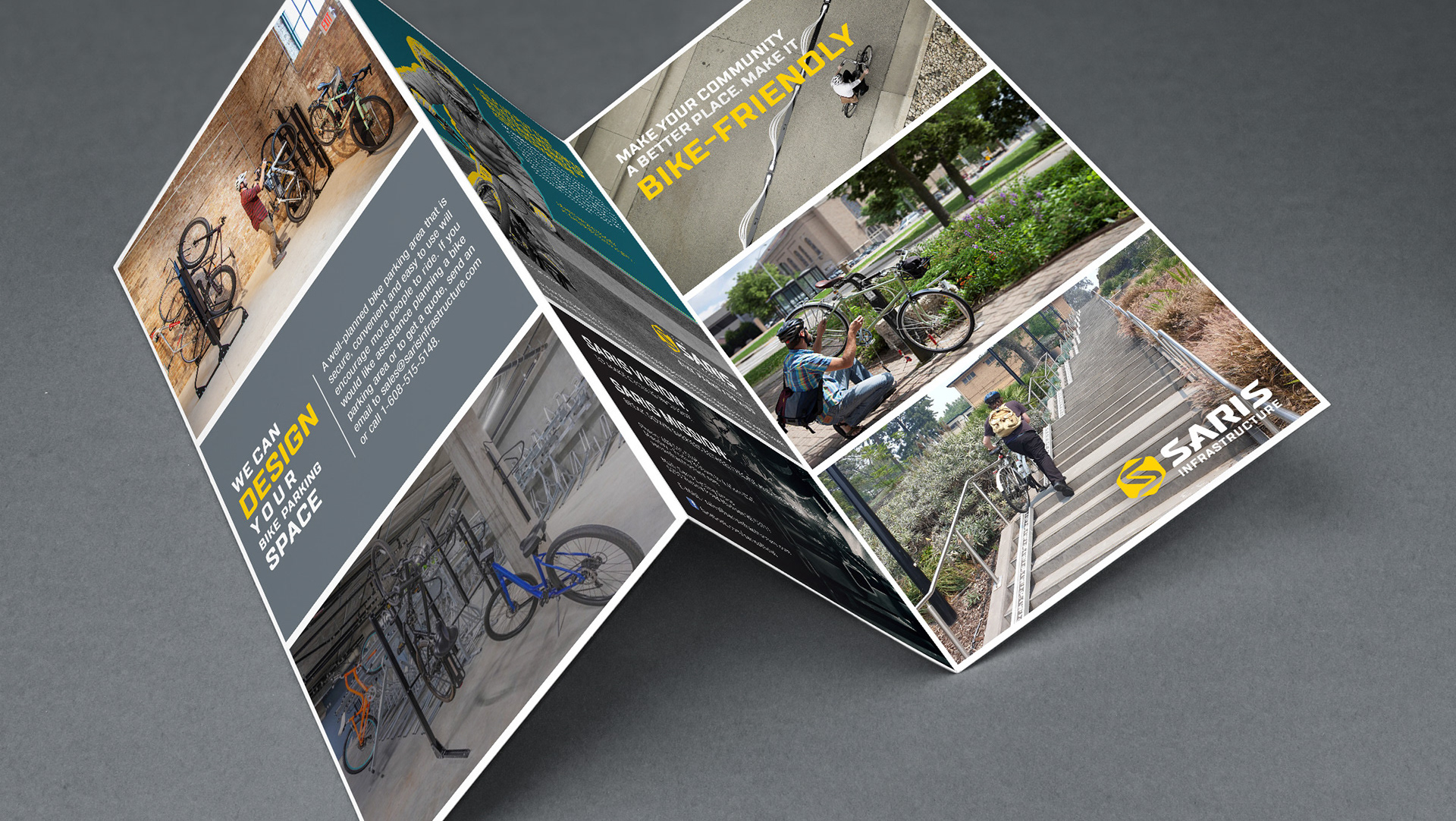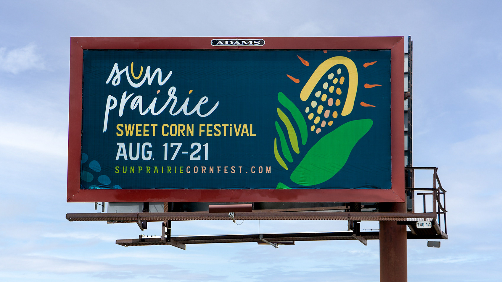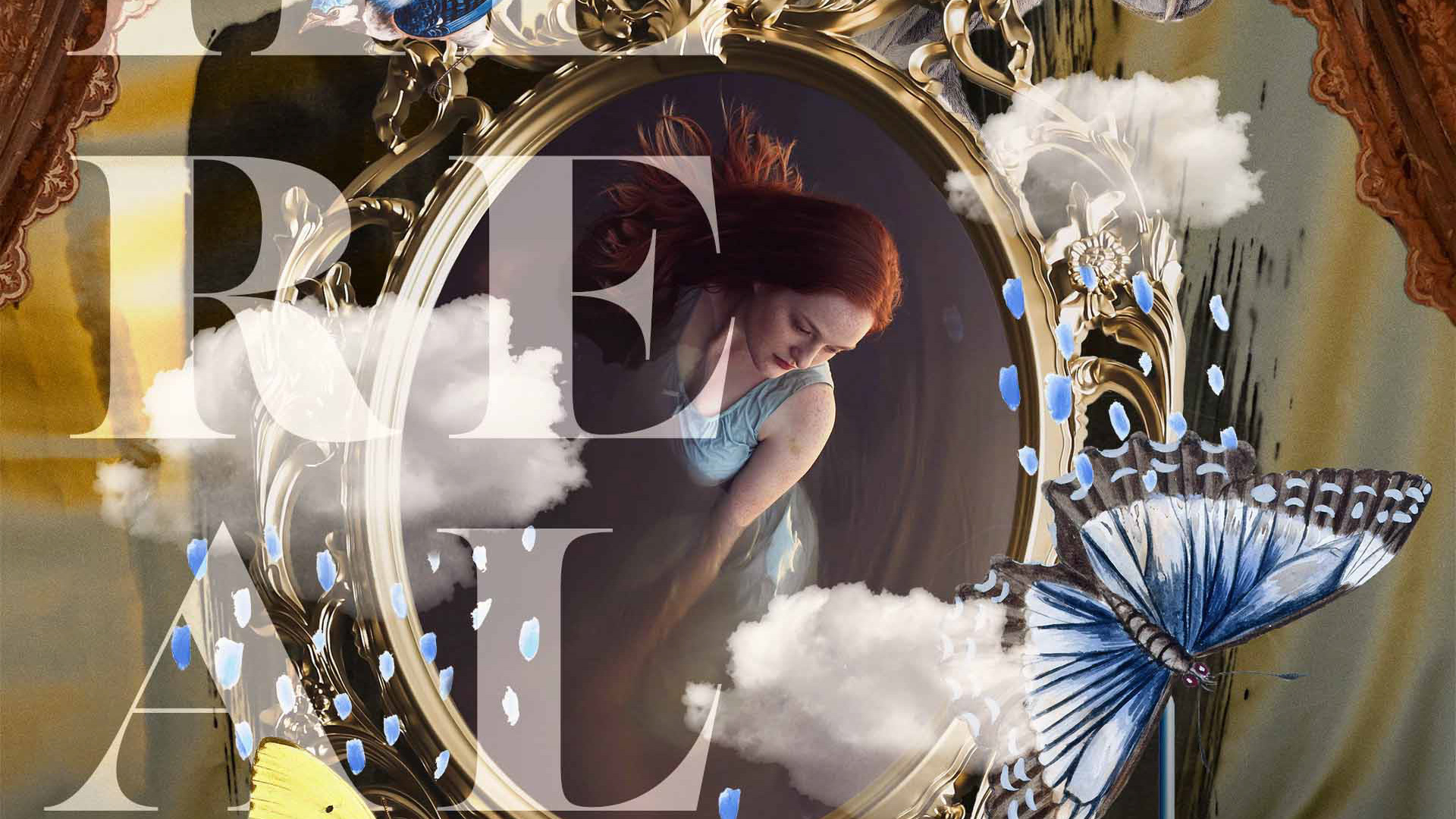

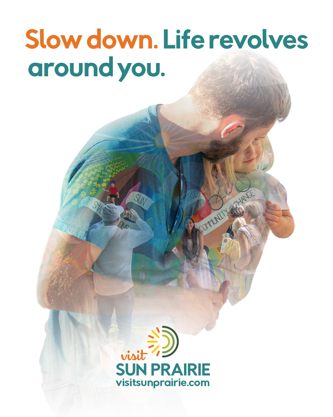
I developed a range of visual assets that highlight connection, inclusivity, and everyday moments. Using a double exposure style, I created imagery that feels both dynamic and grounded in community values. The campaign spans social media, environmental graphics, and print, all while staying consistent with the brand’s existing fonts and color palette. I also adjusted select visual elements, such as clothing and accessories, to better align with the brand’s colors and overall look.
To build out the campaign, I sourced and created a mix of assets, prioritizing local photography when available and supplementing with commercially licensed stock imagery when needed. Each piece was designed to work seamlessly across platforms, creating a cohesive and flexible visual system.
Social Media
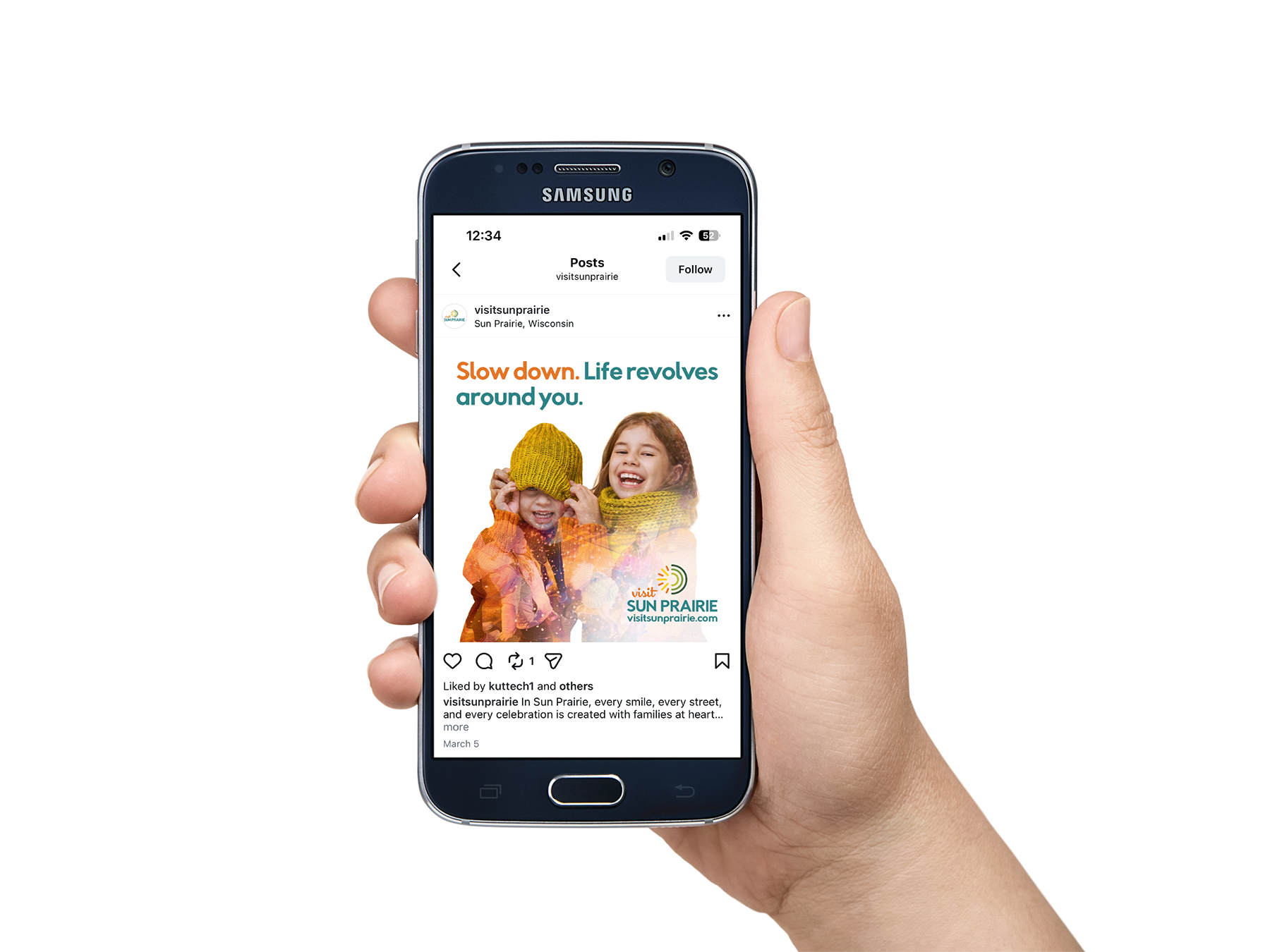


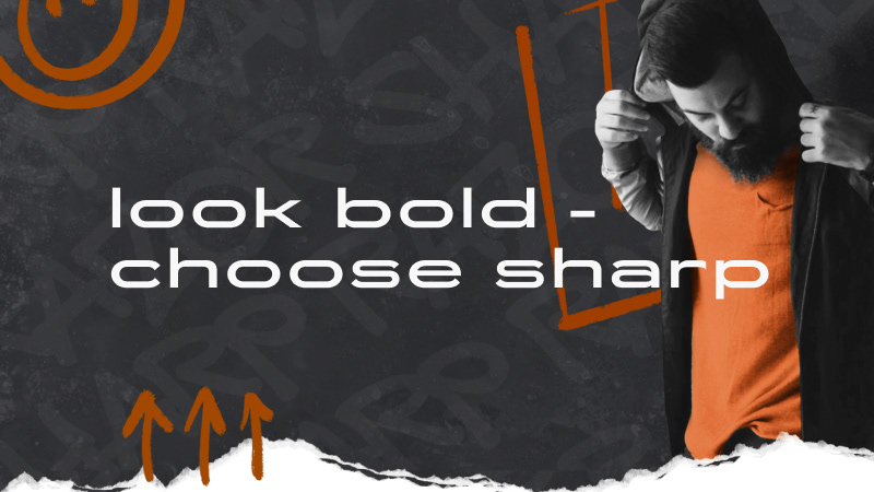
Designed a series of social media graphics tailored to platform-specific dimensions, ensuring each asset maintains visual impact and clarity across formats.
Base Asset Images


A collection of core visuals that establish the look and feel of the campaign, built to be adaptable across multiple applications. Featuring local Sun Prairie images.
Winter Images


Created a set of winter-focused visuals to meet the client’s request for seasonal content, highlighting community experiences during colder months while maintaining brand consistency.
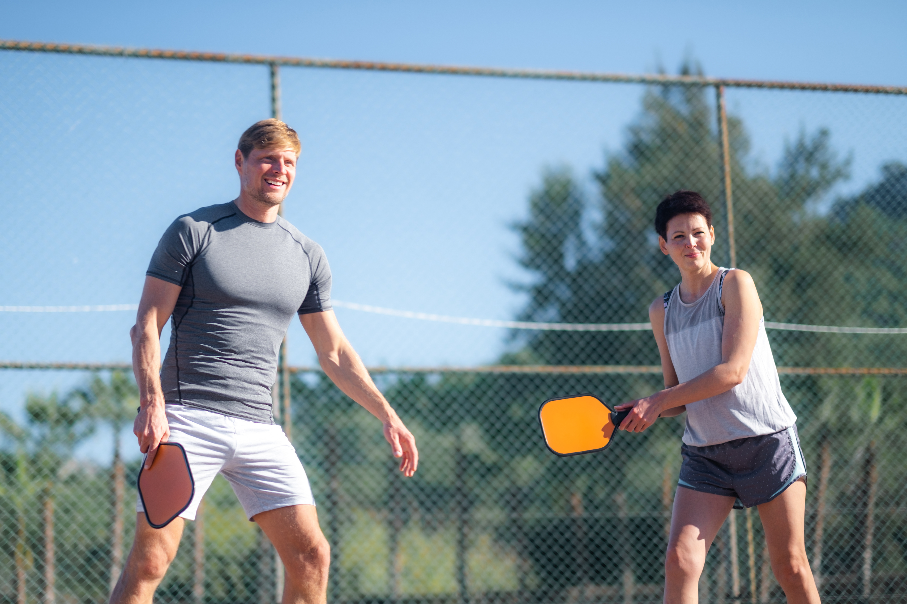
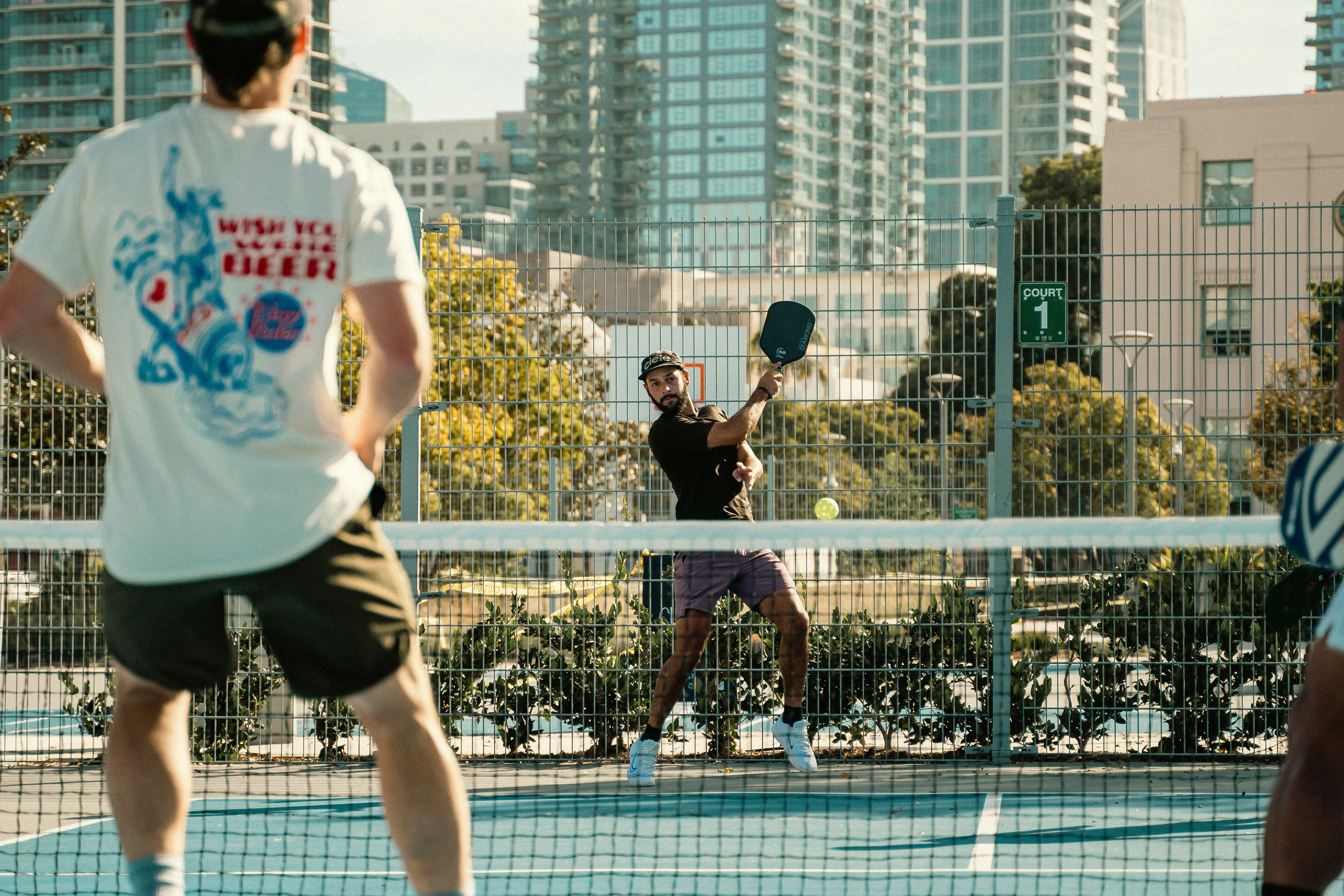
Pickle-ball Images


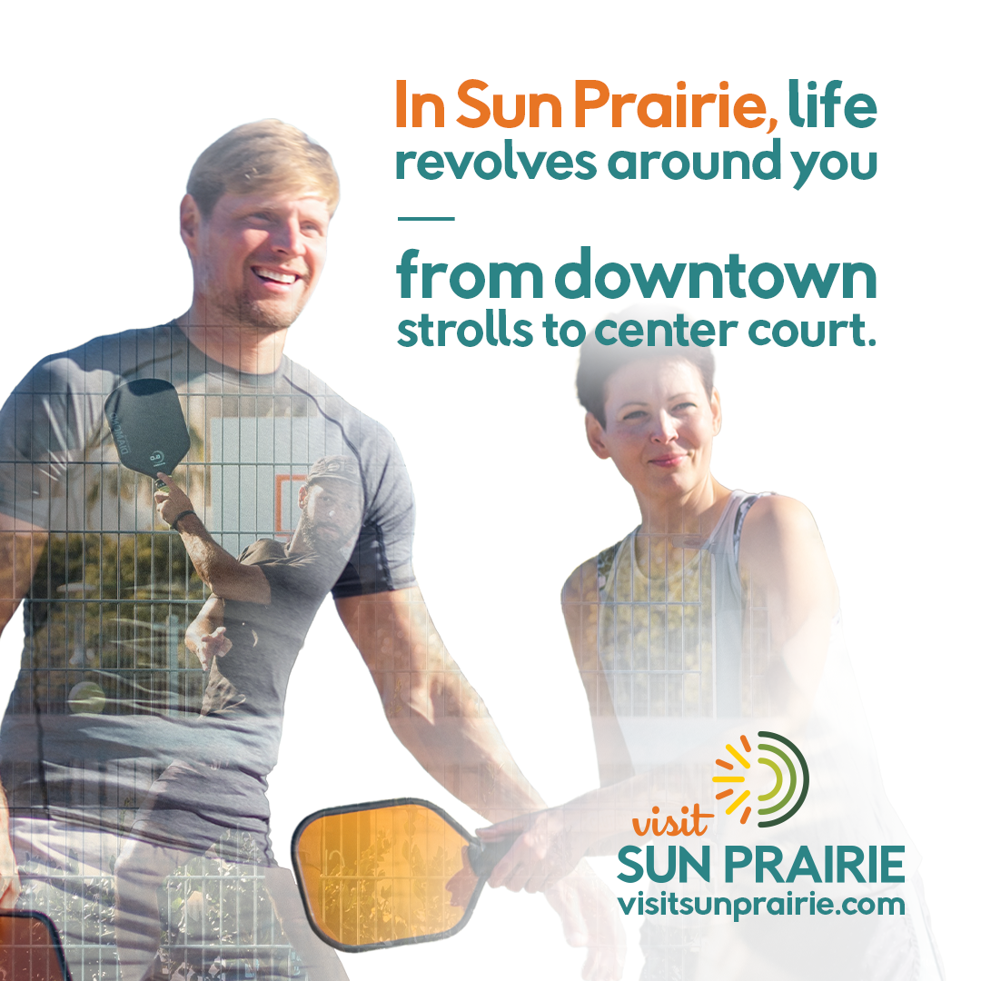
Developed these visuals for a specific community pickle-ball event, capturing energy and movement while staying aligned with the overall campaign style.
Image Creation Process

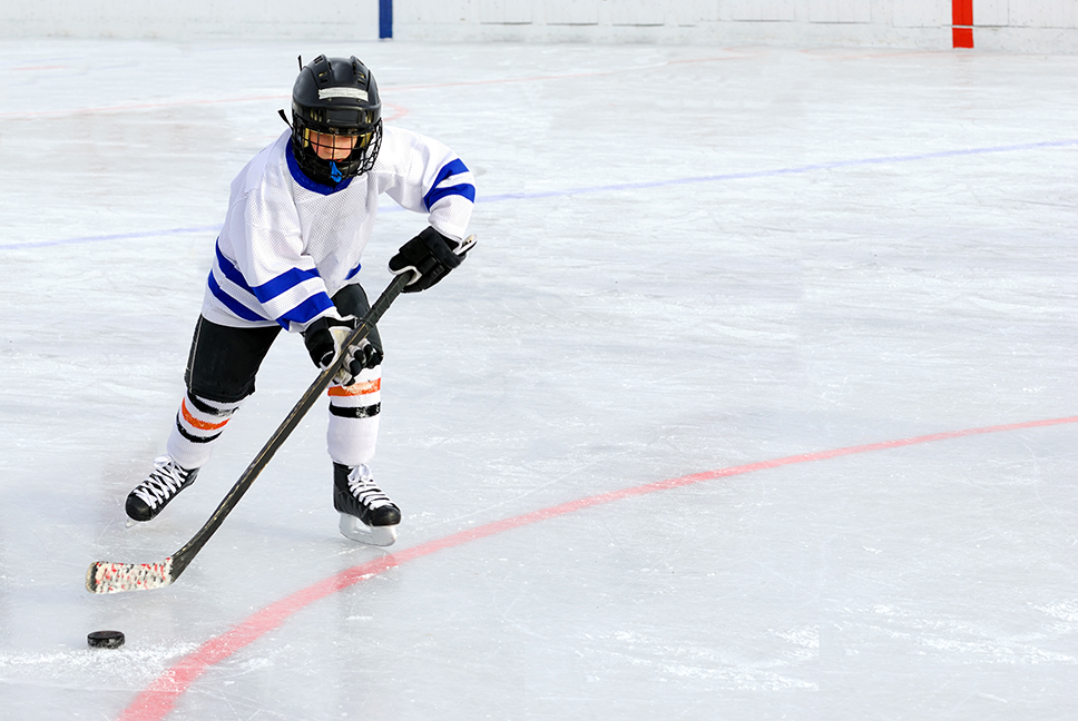
Each double exposure image was created in Photoshop by combining two visuals into a single composition. This involved removing backgrounds, working with layered compositions, and using layer masks and blending techniques to seamlessly integrate imagery.
Website
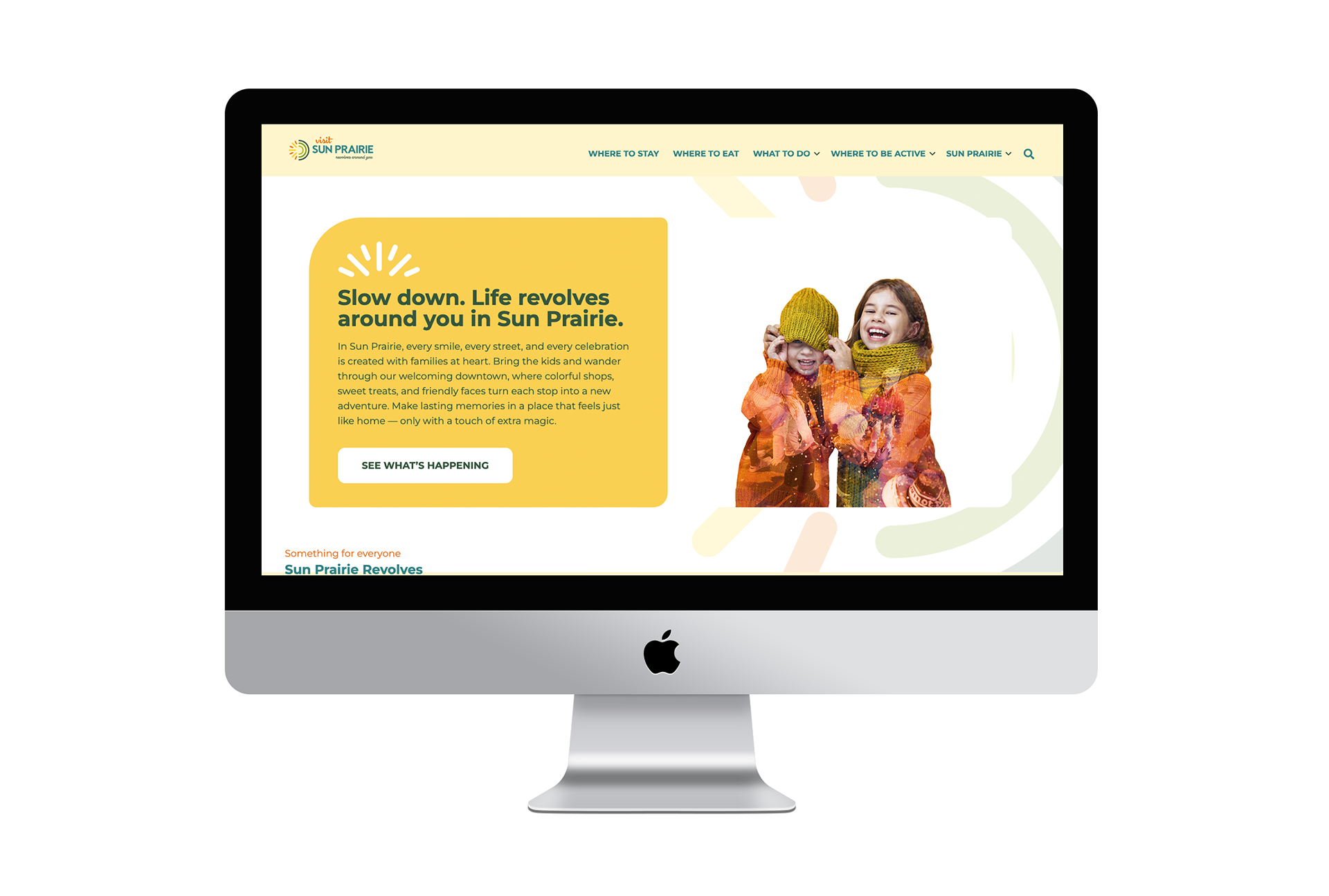
Carried the campaign over to the website, making sure everything feels connected and cohesive.
Magazine Pages
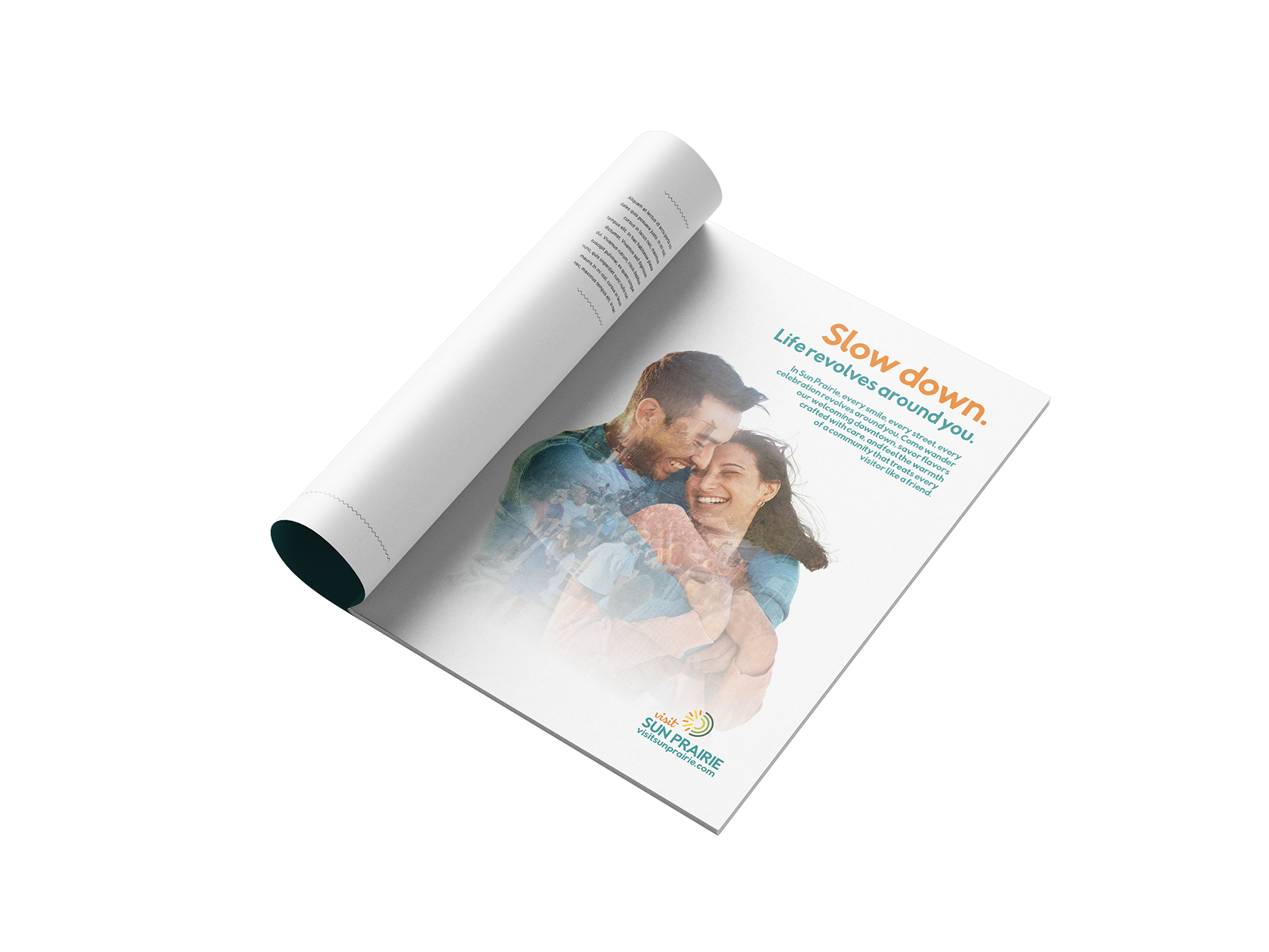
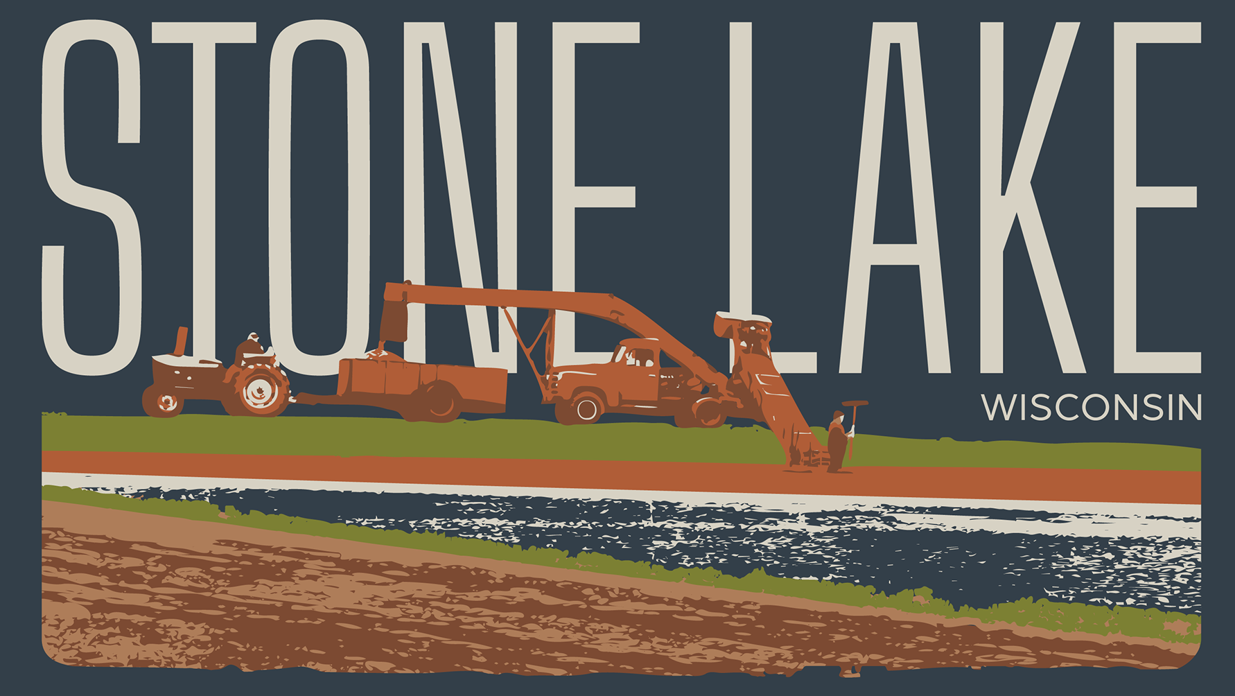
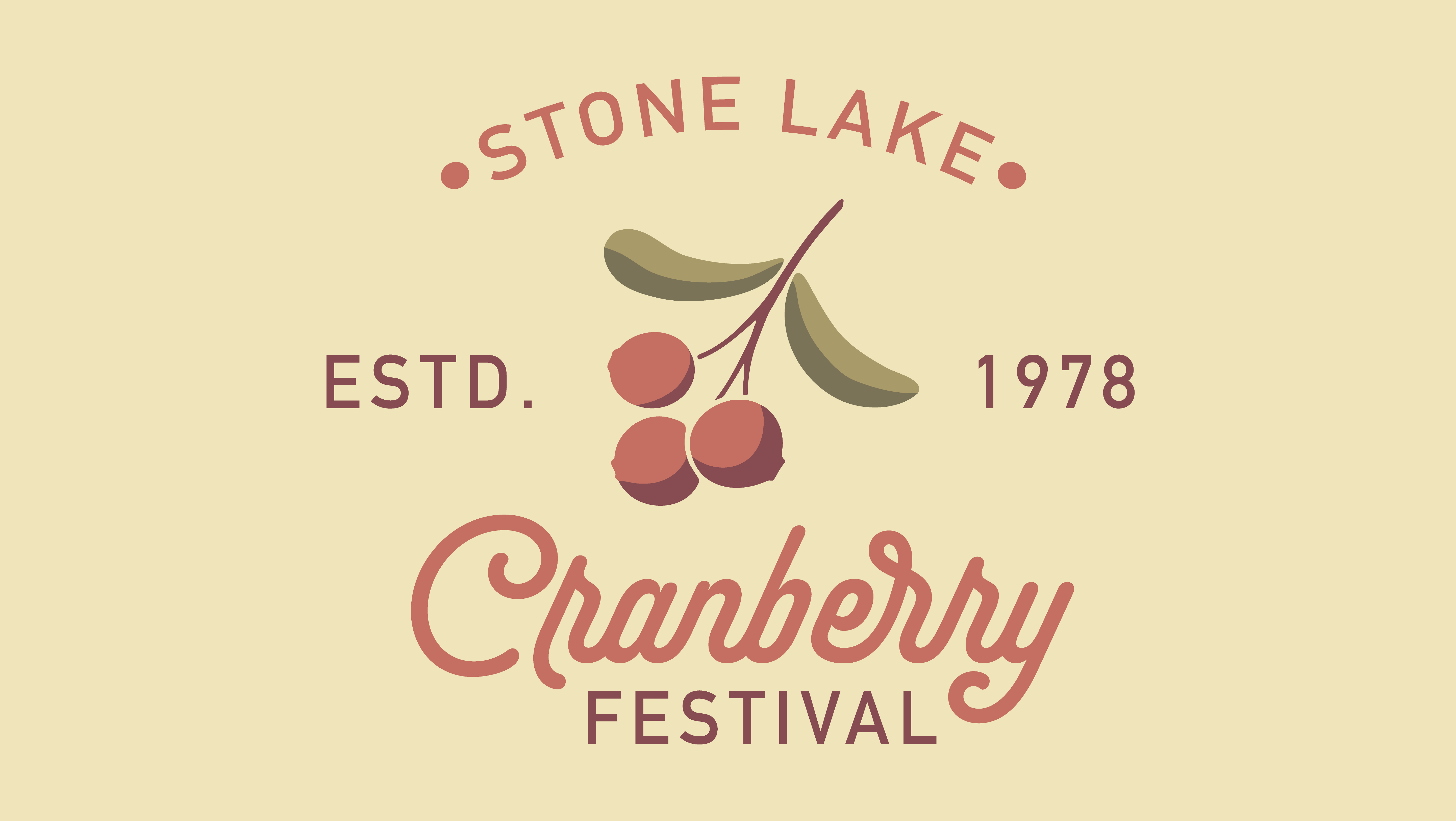
Designed multiple print ads for both local and regional publications, including Milwaukee Magazine and Madison Magazine. This included three full-page ads (May, July, and September 2026) and one quarter-page ad (June 2026), each carefully adapted to different sizes while maintaining a cohesive campaign look.
Community Posters
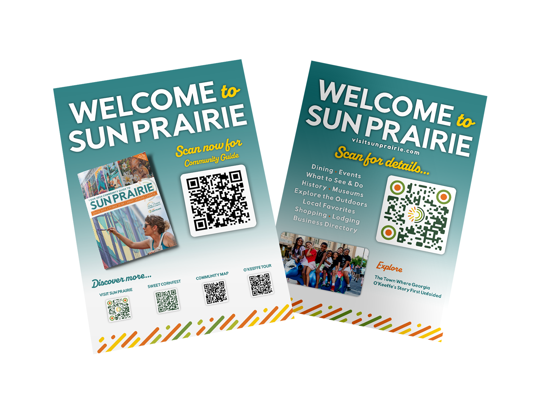
Designed a series of printed posters to be distributed throughout the community, providing easy access to the community guide and other helpful local resources. These pieces were created to inform and engage, helping people quickly discover events, activities, and things to do in the area. I built the designs to reflect the established campaign style, carrying over the same visual language and overall feel.
Ice Arena Kiosk
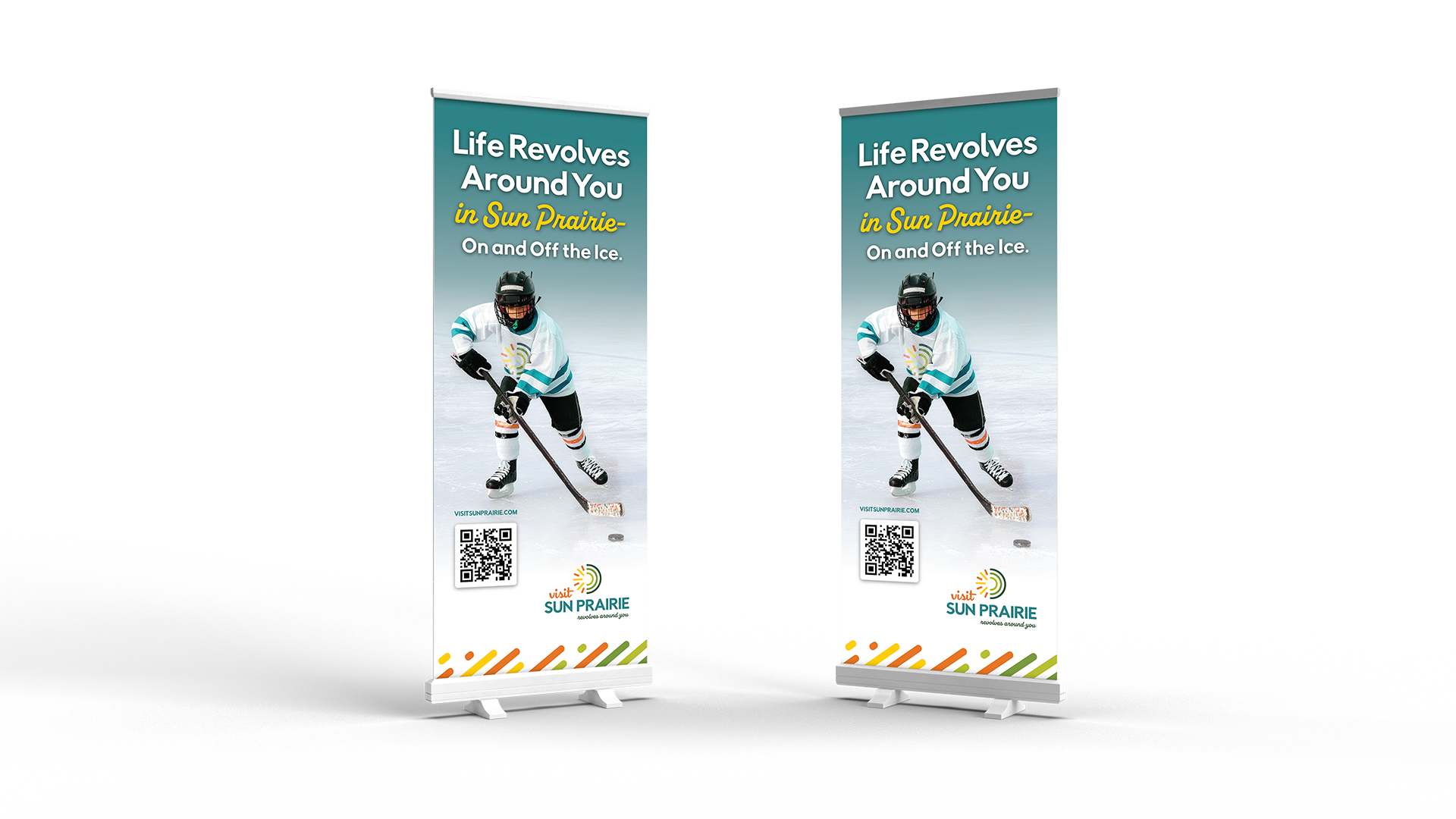
Developed a large-scale environmental graphic for a local ice arena kiosk. This included adjusting jersey and sock colors to match brand standards, integrating the logo naturally with the fabric’s movement, and adding vector elements to enhance the overall design while staying true to the campaign style.