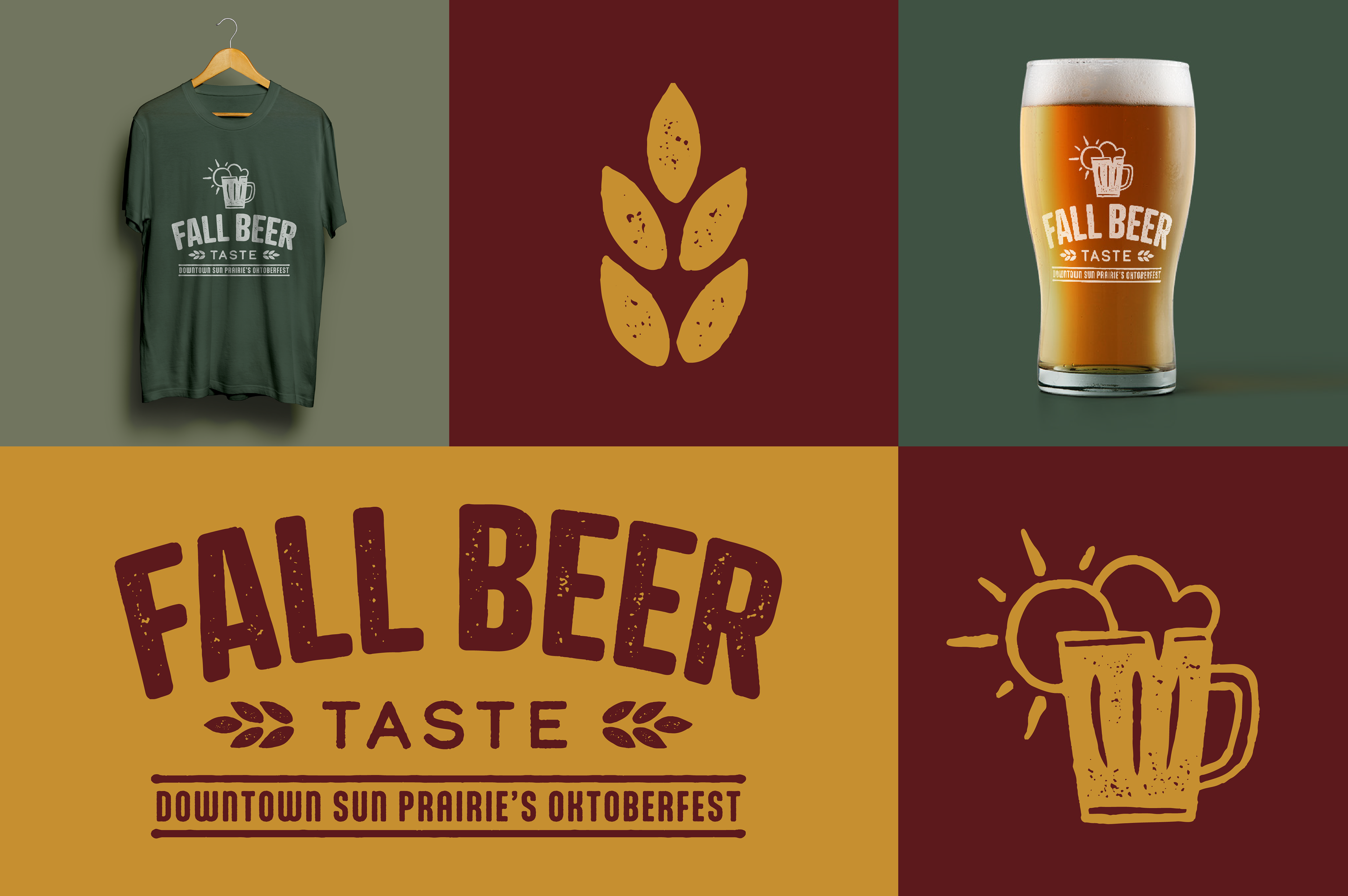
Fall Beer Taste Logo Design
Designing the logo for the Fall Beer Taste Sun Prairie was a rewarding experience. I illustrated the brand mark by hand before bringing it into Illustrator to create a vector. The design incorporates a sun from Sun Prairie and shapes the beer foam to resemble clouds, paying homage to the city. A textured finish adds a rustic feel, enhancing the masculine yet friendly aesthetic. The final result captures the essence of autumn while conveying a professional yet inviting vibe, perfectly reflecting the enjoyable beer experience.
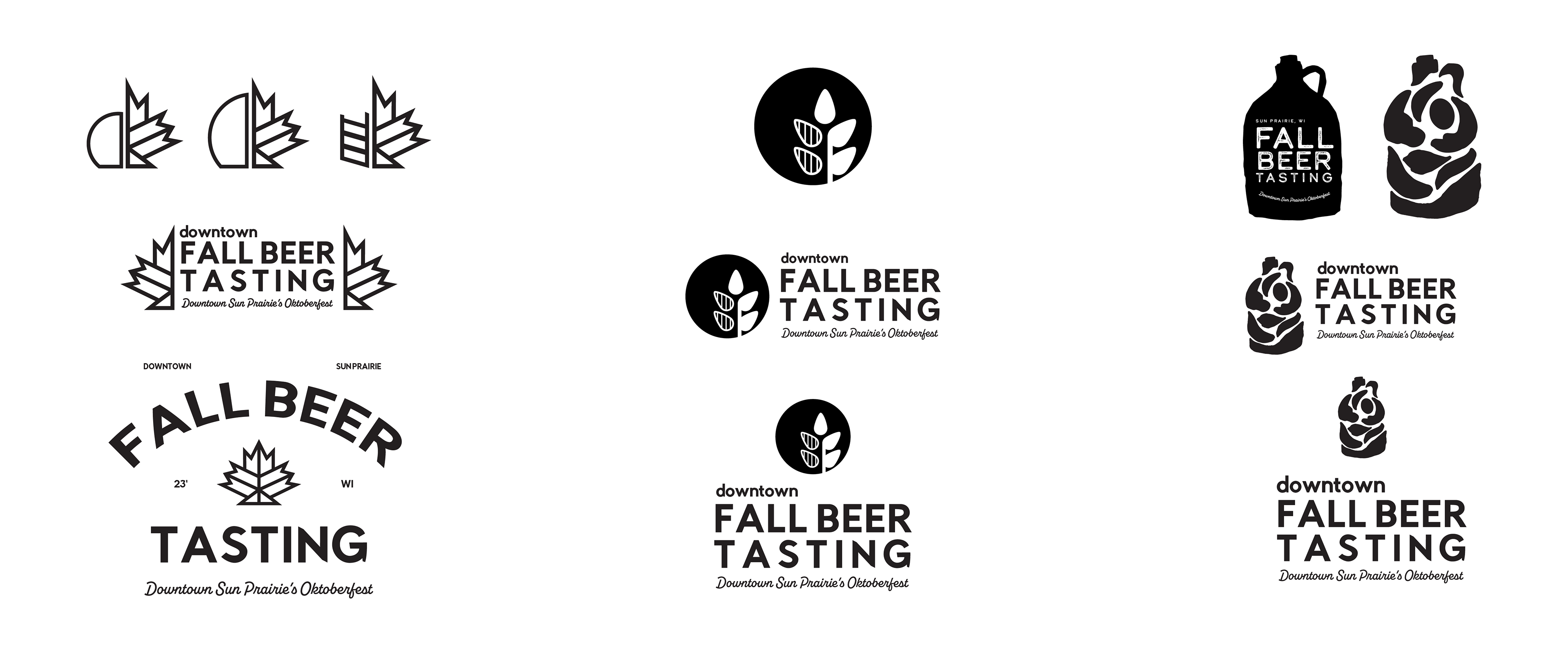
Below are alternative logo concepts that, though not chosen as the final designs, highlight the creative and compelling options I explored during the design process.
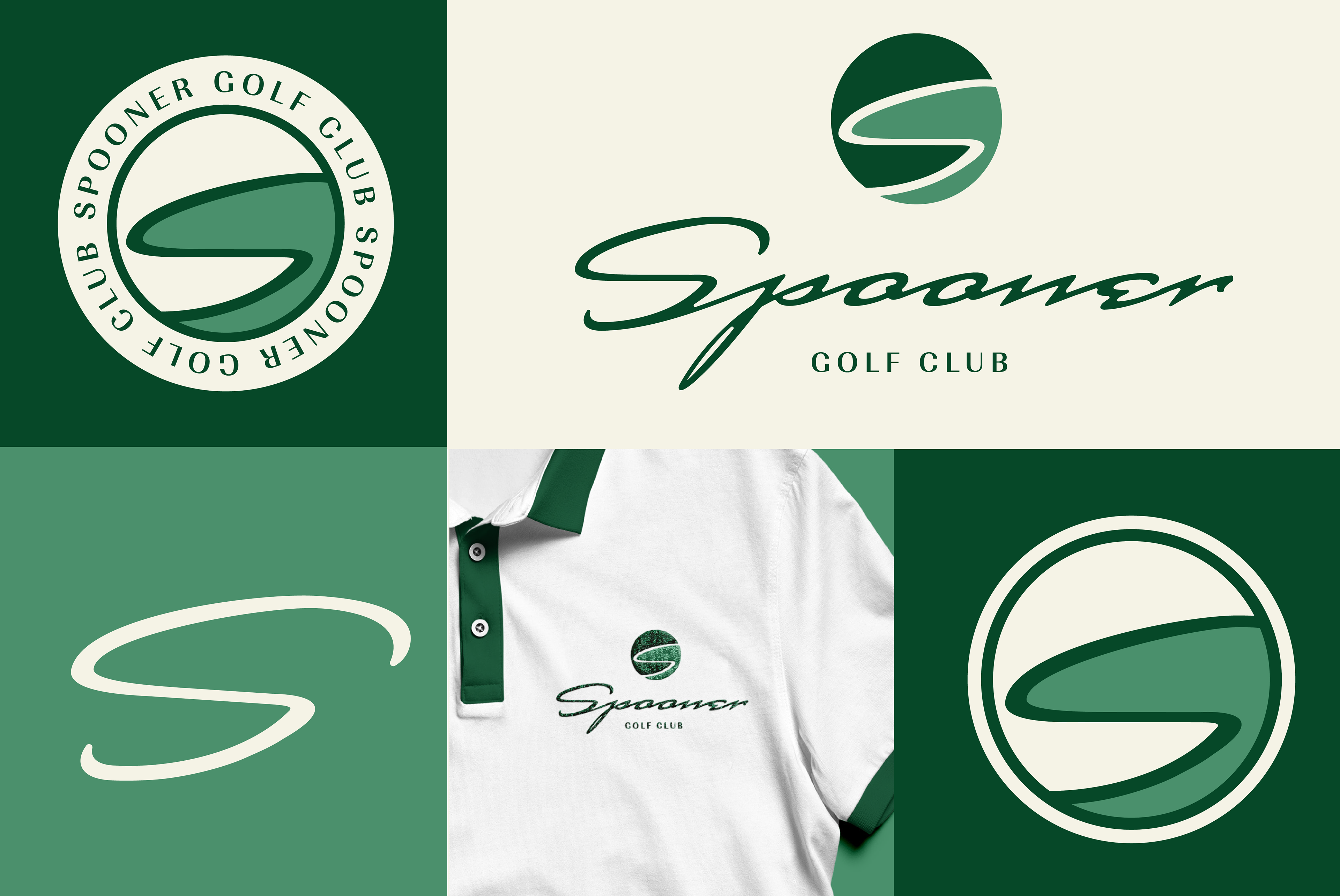
Spooner Golf Club
When creating this logo, my goal was to design something that could easily translate onto merchandise while embodying a masculine, sleek, and sophisticated feel. The logo is circular to represent a golf ball, with different shades of green symbolizing the fairways and greens found on the golf course. The final design captures a strong, refined essence, making it perfect for everything from merchandise to print materials and web.
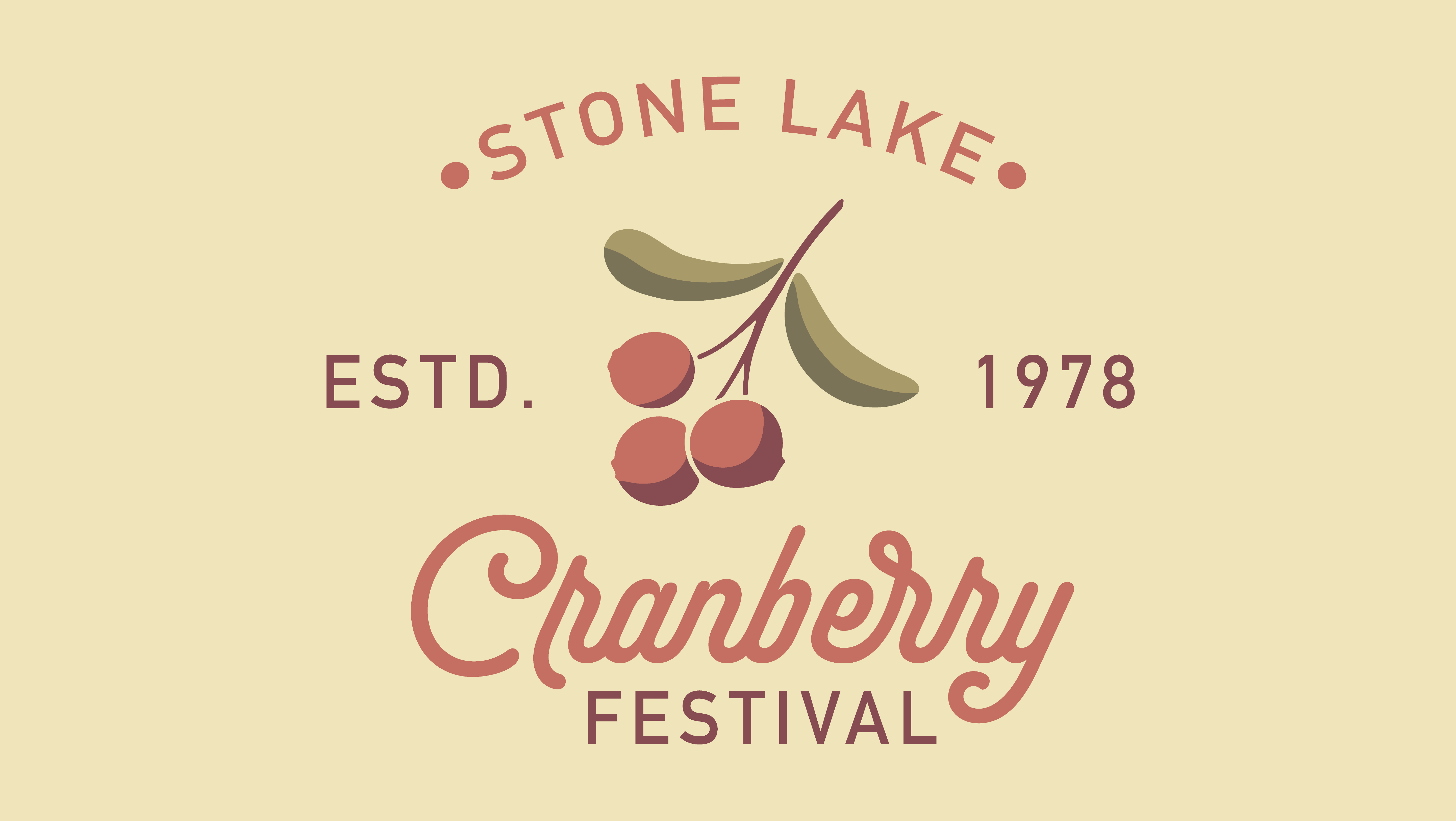
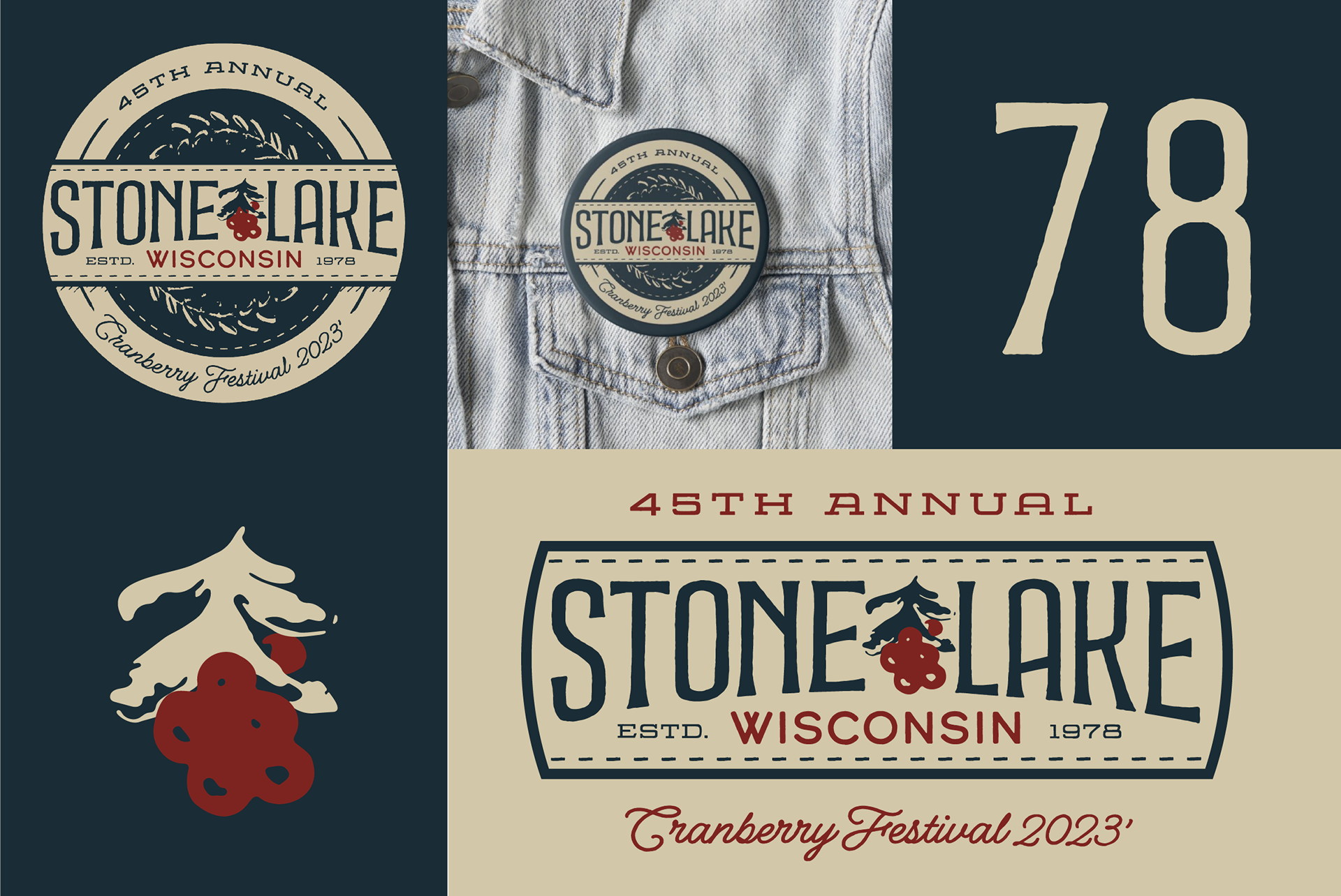
Stone Lake Cranberry Festival - Button Design
Creating a button for the Stone Lake Cranberry Festival was a rewarding project, aimed at capturing a rustic, welcoming, and vintage vibe. The cranberry was hand-drawn and then brought into Illustrator to turn it into a vector, allowing me to bring the design to life. The final result evokes nostalgia, perfectly fitting the festival's atmosphere and creating a warm, inviting feel.
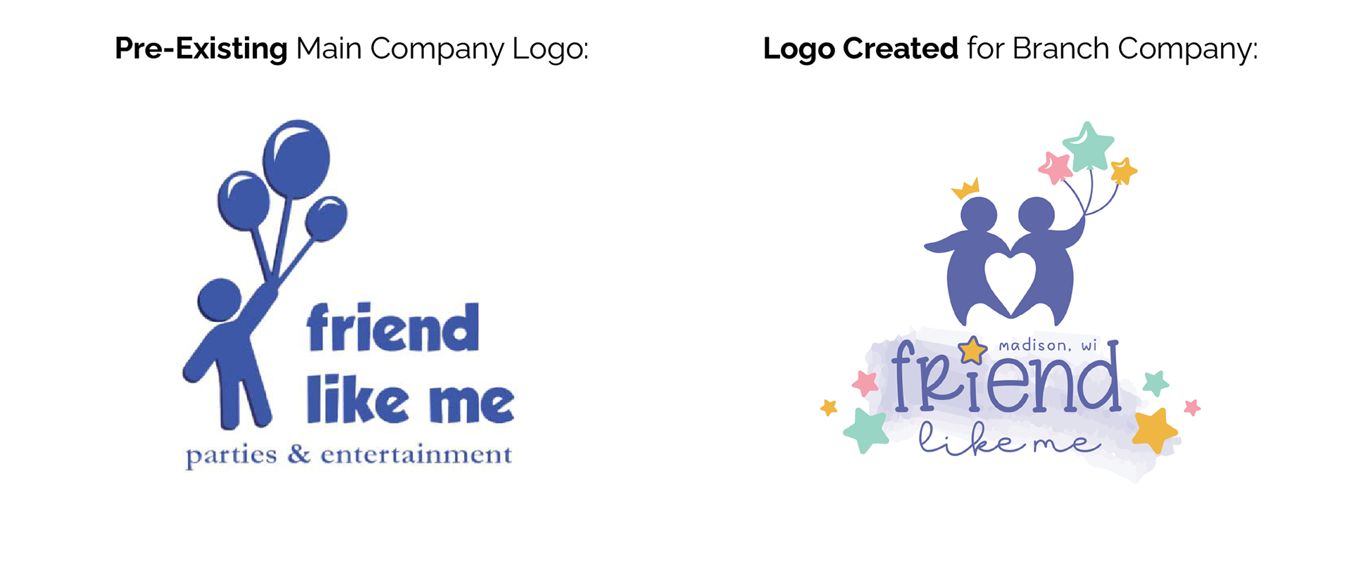
Friend Like Me - Branch Logo Creation
Tasked with creating a logo for a branch company, I drew inspiration from the main company's logo to craft a distinct identity that maintains a clear connection with the overarching brand.
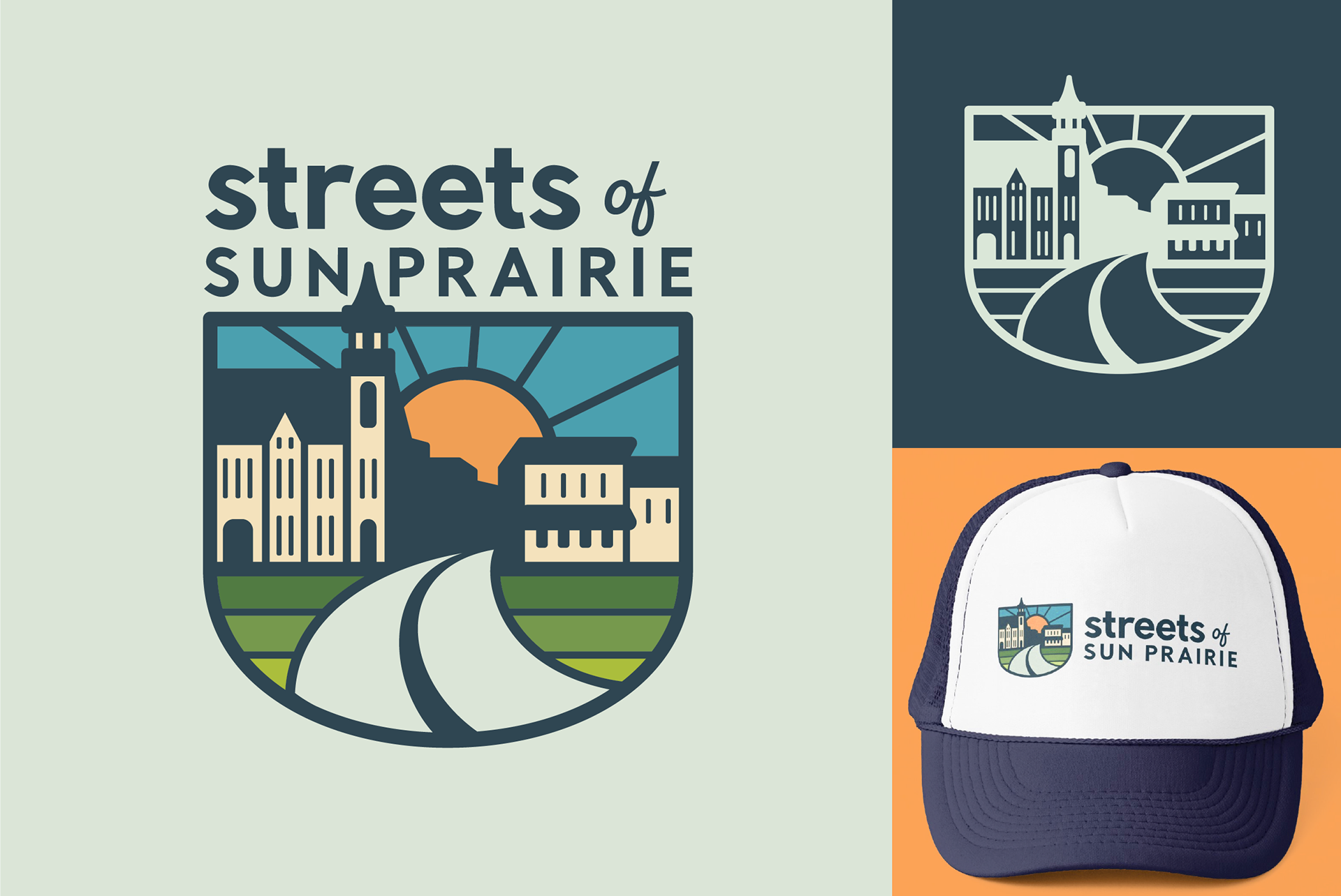
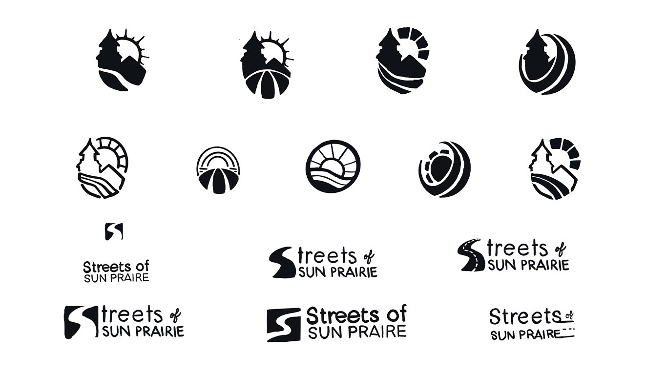
Streets of Sun Prairie
I designed the logo as a tribute to Sun Prairie, drawing inspiration from the city's actual layout. While designing, I went out and took photos of the city skyline to accurately portray the city in the design. The result seamlessly incorporates its features while maintaining a bold and inviting aesthetic.
Streets of Sun Prairie Sketches
This collection of sketches for Streets of Sun Prairie showcases alternative logo concepts, each exploring unique design possibilities.
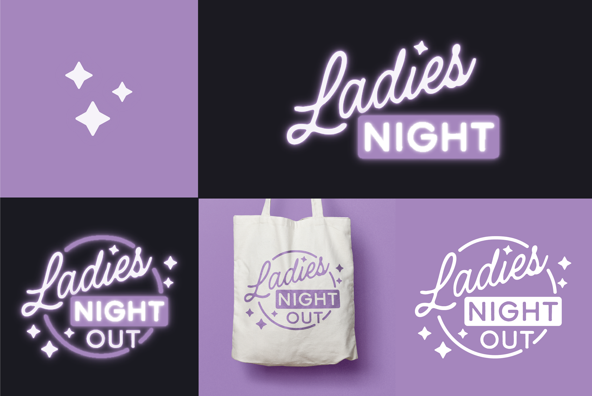
Ladies Night Out Logo
Designing the logo for Ladies Night Out was an enjoyable project. I focused on creating a design that radiates inclusivity and fun, aiming to craft not just a logo, but an invitation to an evening of camaraderie and celebration.
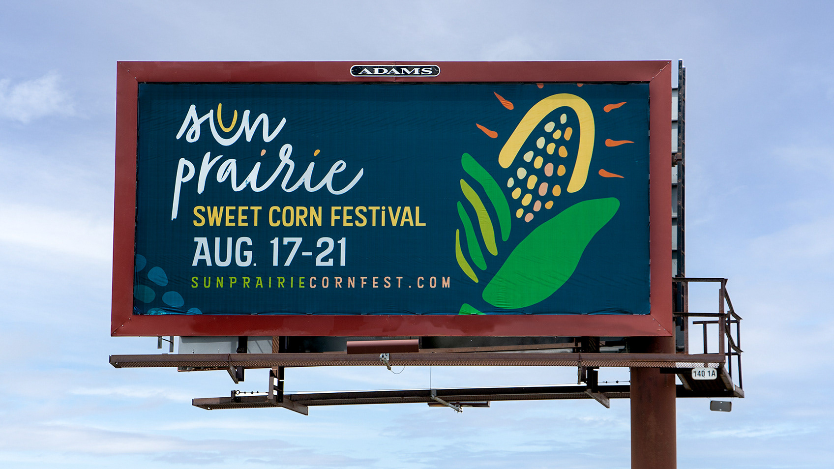
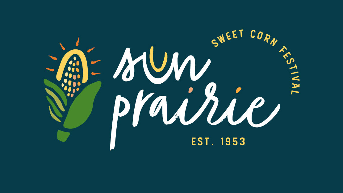
Sun Prairie Farmers Market
Creating the logo for the Farmers Market was a fulfilling project. I had to consider the city's new logo to ensure the design aligned with its branding. The focus was on instilling a sense of inclusivity, community engagement, and a welcoming ambiance. I drew the brand mark in Illustrator, ensuring it would remain clear and readable in a single color for print purposes. The final result reflects the market's commitment to fostering a sense of community and shared connection.